 Skip to content
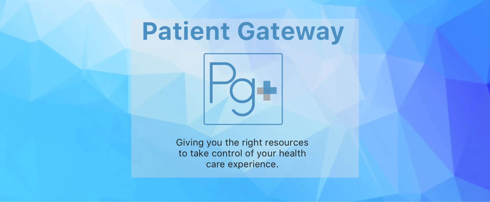
Duration:
January 2018 (3 weeks)
Problem Statement
How might we help families that have children in a pediatric hospital staying for extended periods of time?
Product Overview
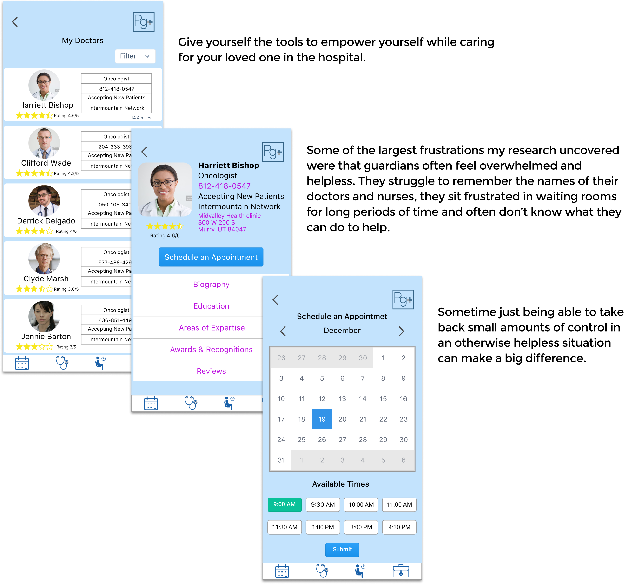
In this case study I explore the needs of guardians who have to rearrange their life when their loved one needs them most, and to help them find a solution to the countless hours spent in hospitals. Everyday thousands of people find their lives disrupted by the healthcare system. Parents and guardians of patients often have their needs overlooked in this situation.
The outcome is Patient Gateway an app designed to simplify the healthcare system for guardians of repeat patients requiring extended care, both as in and out patients.
Responsibility
From October 2017 to November 2017 I worked as lead designer for a social design challenge called Patient Gateway. I was responsible for the research, information architecture, interaction design, prototyping, visual design, copywriting, and user testing.
Tools
- Sketch
- Invision
- G Suite
- Principle
- Whimsical
- White boarding
Background
The whole idea of creating an app for families with children in the hospital was brought up by the personal experiences of colleagues who had gone through similar experiences. The question that drove the design challenge was “how might we help families that have children in a pediatric hospital staying for extended periods of time?”
Design Process
For this challenge I used a five step process that allowed me to understand the user experience quickly and explore possible solutions that could later be fine tuned through testing.
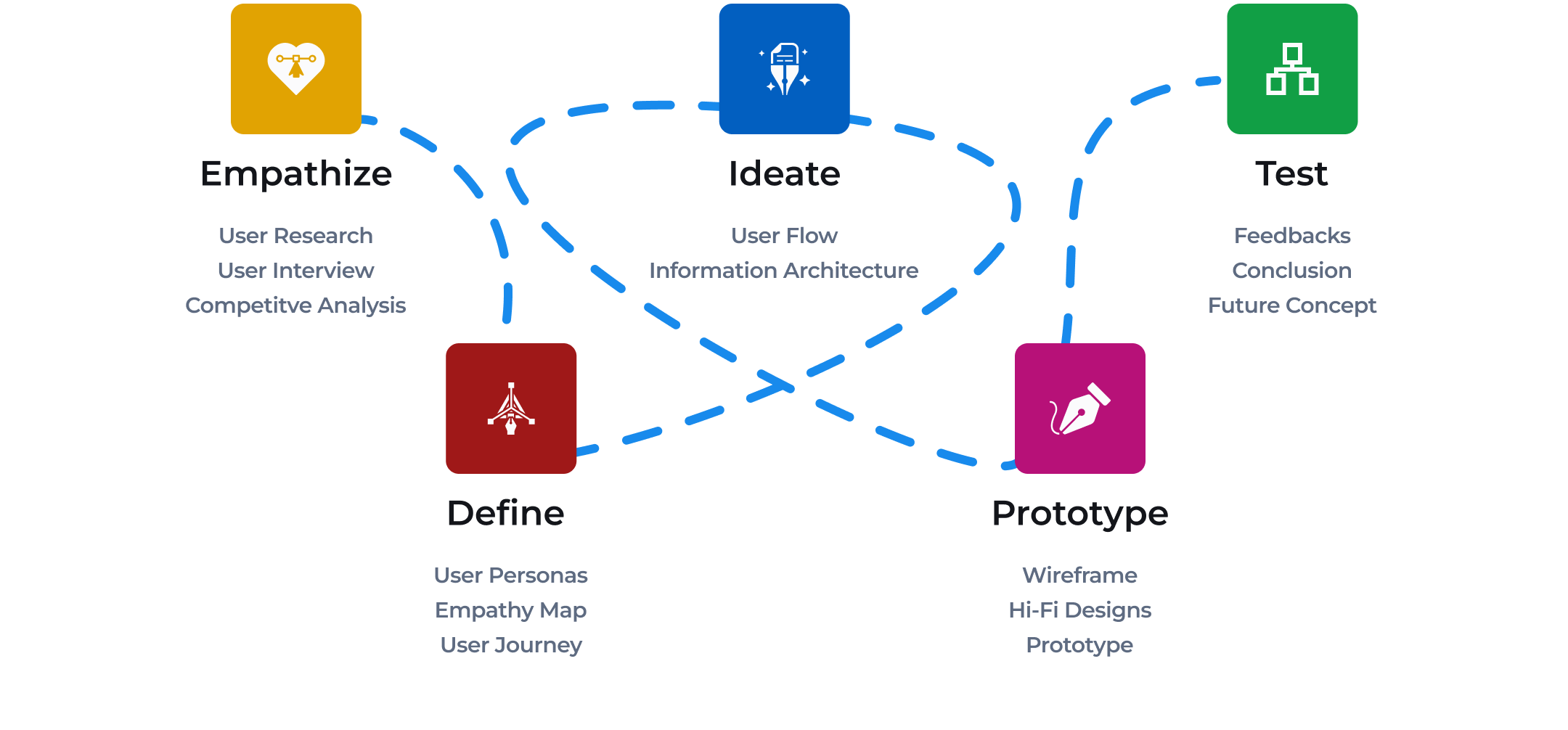
Empathize
- Design Process
- User Interview
- Competitve Analysis
Ideate
- User Flow
- Information Architecture

Test
- Feedbacks
- Conclusion
- Future Concept
Define
- Design Process
- Empathy Map
- User Journey

Prototype
- Wireframe
- Hi-Fi Designs
- Prototype
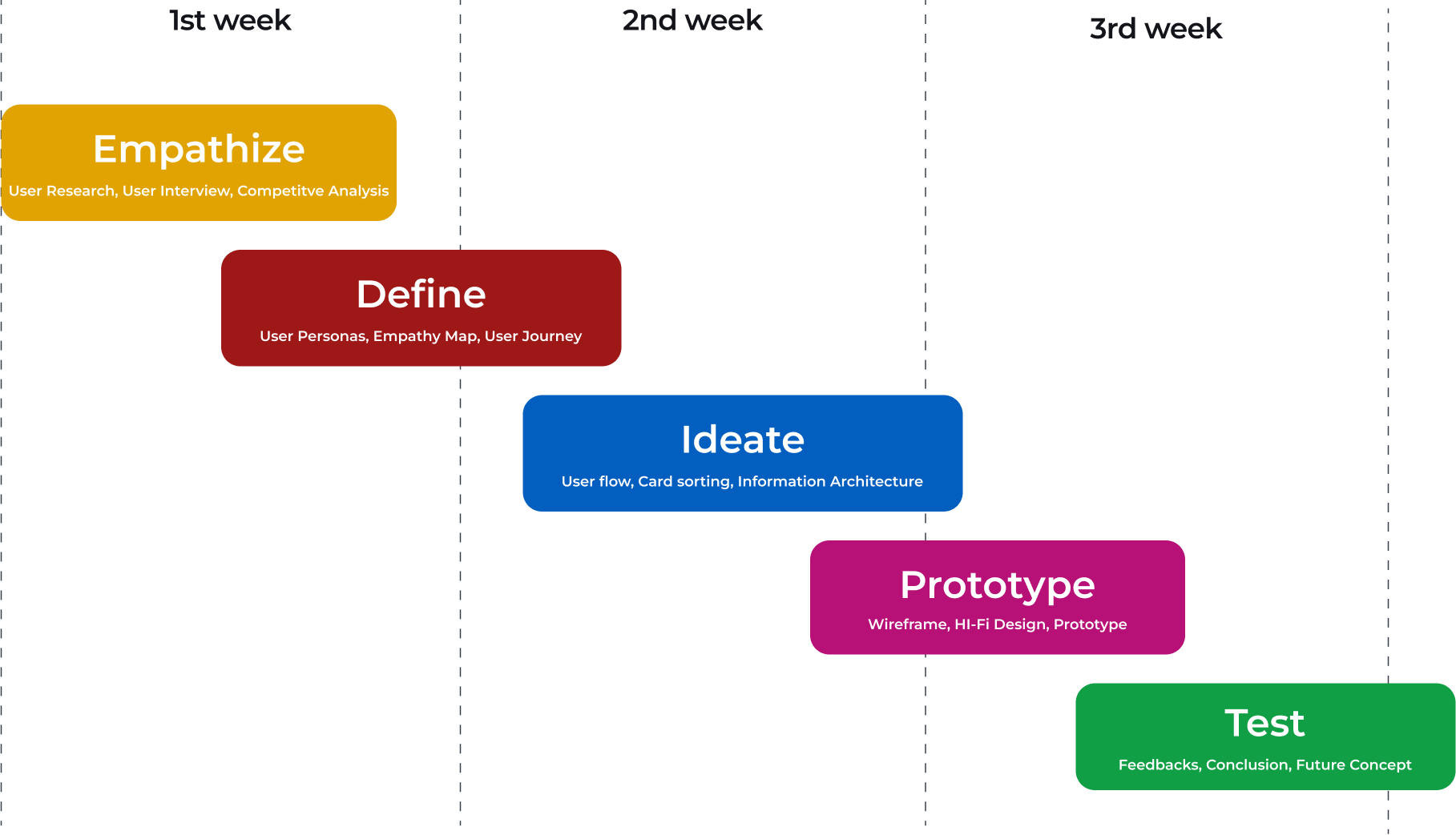
Design Timeline
Assumptions
Assuming that some guardians end up finding a place to stay nearby while their loved one is being treated for serious illness I began researching blogs, hospital resources and hospital lodging deals. Search results did not turn up much in the way of lodging resources or the need for them from support group sites. Wanting to find out more about what kind I resources would be most useful I wrote up a list of questions that might help me better understand user needs.
Interview
To better understand the needs of guardians, I interviewed hospital patrons and staff members at Primary Children’s Hospital in Salt Lake City, UT. The interviews probed at the issues parents and guardians face during prolonged healthcare. I asked parents about how long their child had been in the hospital, if they ever stayed overnight and what they wish the hospital would do differently. When it came to the staff I focused on what kind of resources are available to parents and what kind of changes could have the biggest impact.
Survey
I formulated an online survey based on interview results and assumptions. The survey was distributed via web links and targeted anyone that had been in the role of guardian during a hospital experience.
User Research
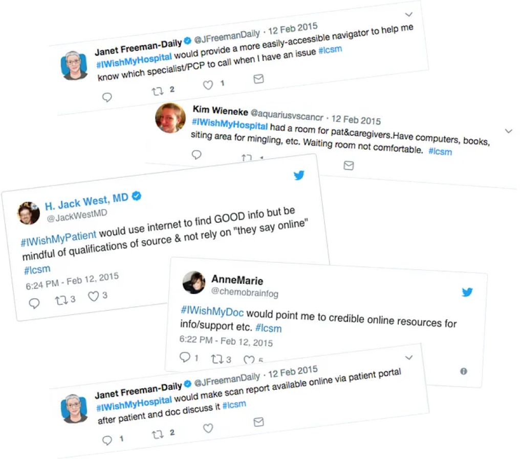
With a strong base knowledge and direction, I turned to outside studies to expand on the survey data and focused interviews. One of the most helpful studies was “Flip The Clinic”, which gathered a variety of pain points from patients, doctors, nurses and hospital staff using hashtags on twitter.
The Twitter based study expanded my data and solutions to incorporate a larger target audiences that dealt with similar issues. The broadened group included spouses and adult children caring for family members in prolonged care. Flip the clinic focuses on qualitative data so I used their research in much the same way I would interview results.
Observations
The results showed that most parents and guardians found it difficult to manage outside life during prolonged care. The issue of being able to stay at the hospital overnight was not as far reaching as initially presumed. The data rather pointed out that hospitals were already providing overnight accommodations, but lacked digital resources (see results below). One of the most common pain points the surveys revealed was that parents spent a large percent of their time managing doctors appointments and sitting in waiting rooms. By analyzing survey responses and exploring the resources available to patrons at all the surrounding hospitals, I realized that many resources remained unexplored by patrons.
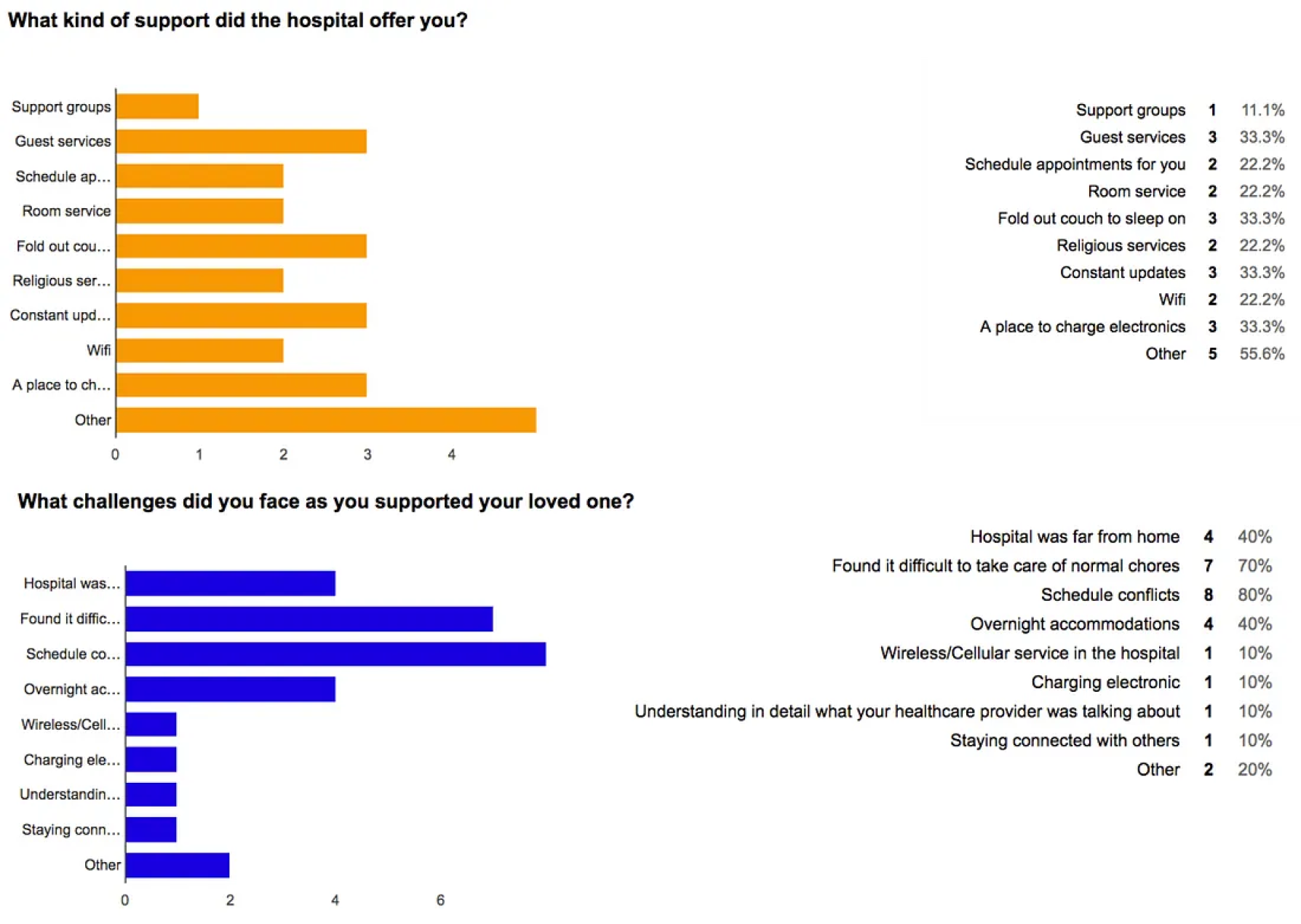
Observations
80%
Had challenges scheduling convenient appointments times.
70%
Found normal everyday task complicated when paired with hospital stays.
40%
Found it difficult to stay near or on hospital grounds overnight.
40%
Found the hospital they wanted to use was too far from home.
33%
Used a form of guest services provided bny the hospital.
55%
Used unique services provided by the hospital that were not listed on their website.
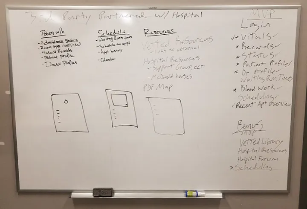
White Boarding
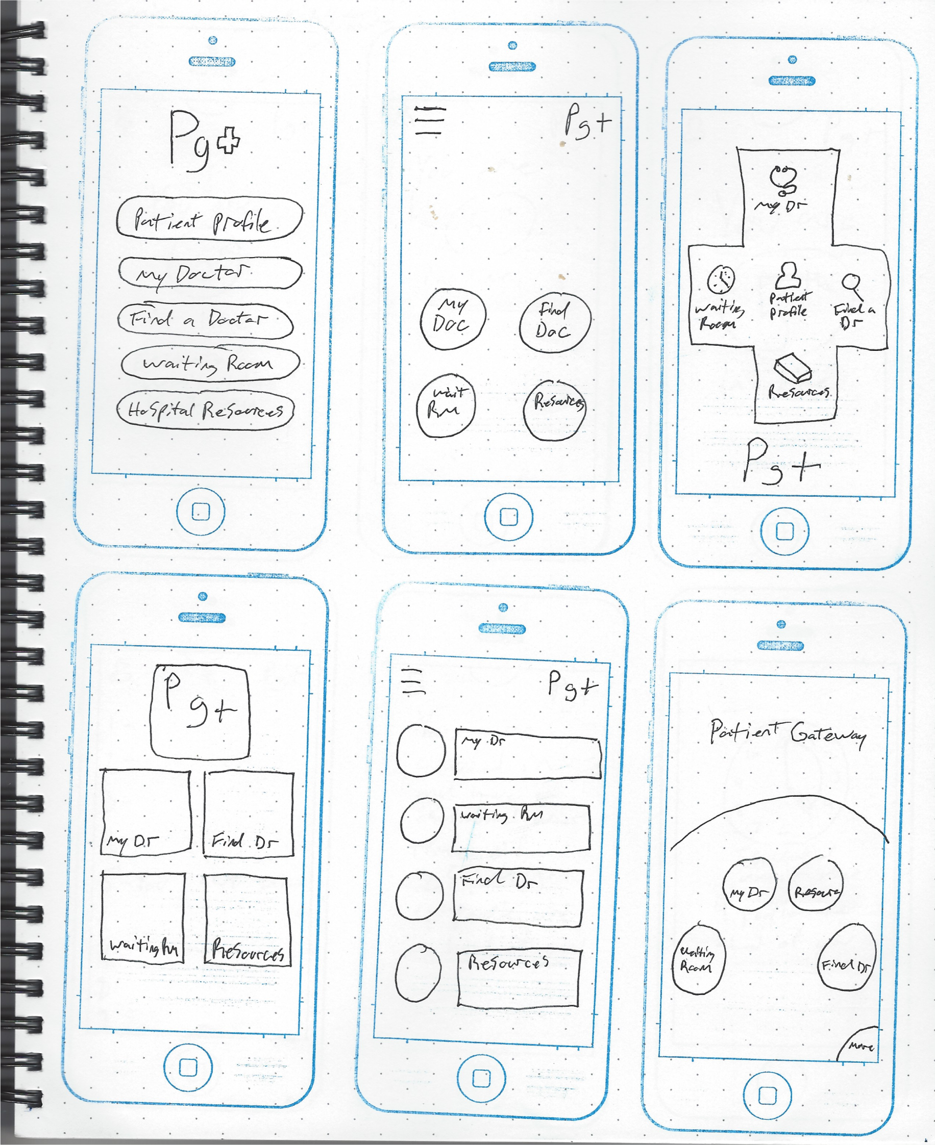
During brainstorming I started sorting ideas into categories (patient info, scheduling, resources, etc) to get an idea of the project scope. Many of the possible solutions survey data and outside research revealed a rabbit hole of possibilities. Using the the primary persona I further sorted the solutions to fit the project goals and developed a Minimal Viable Product (MVP).
A couple of the solutions that were hard to filter out were live updates regarding patient records, a vetted hospital library and a hospital forum. With only 4 weeks to build an initial product and possible complications with HIPPA laws, I chose to revisit the more complex solutions during a later release.
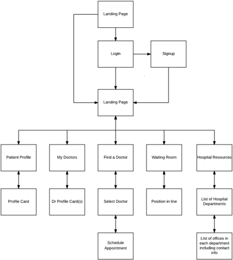
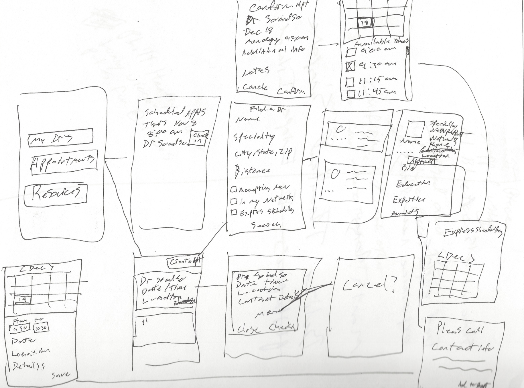
Site Map/User Flow
With a MVP in place, I created a sitemap to clarify design and build a road map to each feature of the app.
This helped clarify the effort it would take to complete the initial prototype screens during testing.
Ideations
That moment when all those imaginative ideas start to take on a physical
form is really exciting. I opted for 10X10 sketching in the initial stages of the
project to try and get out as many ideas as possible, as quickly as possible.
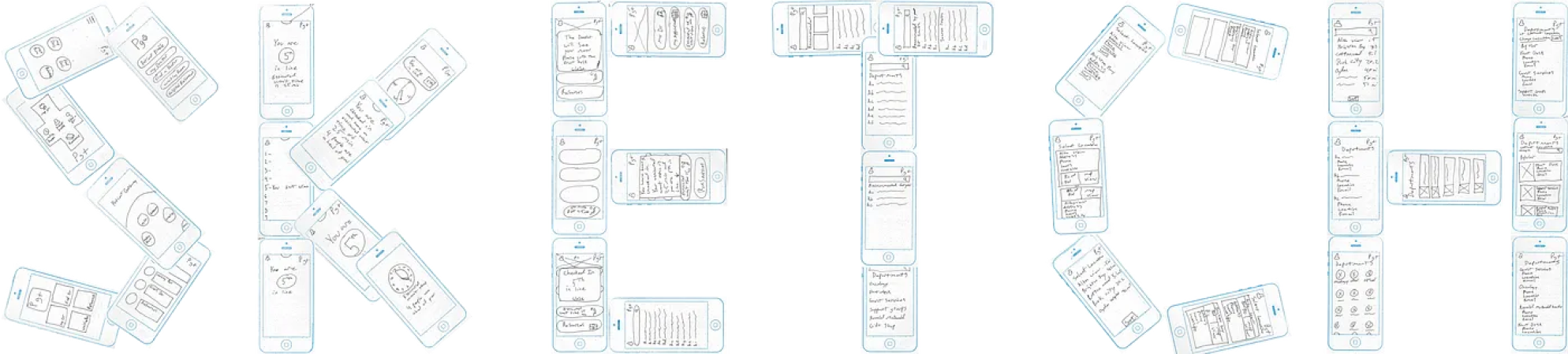
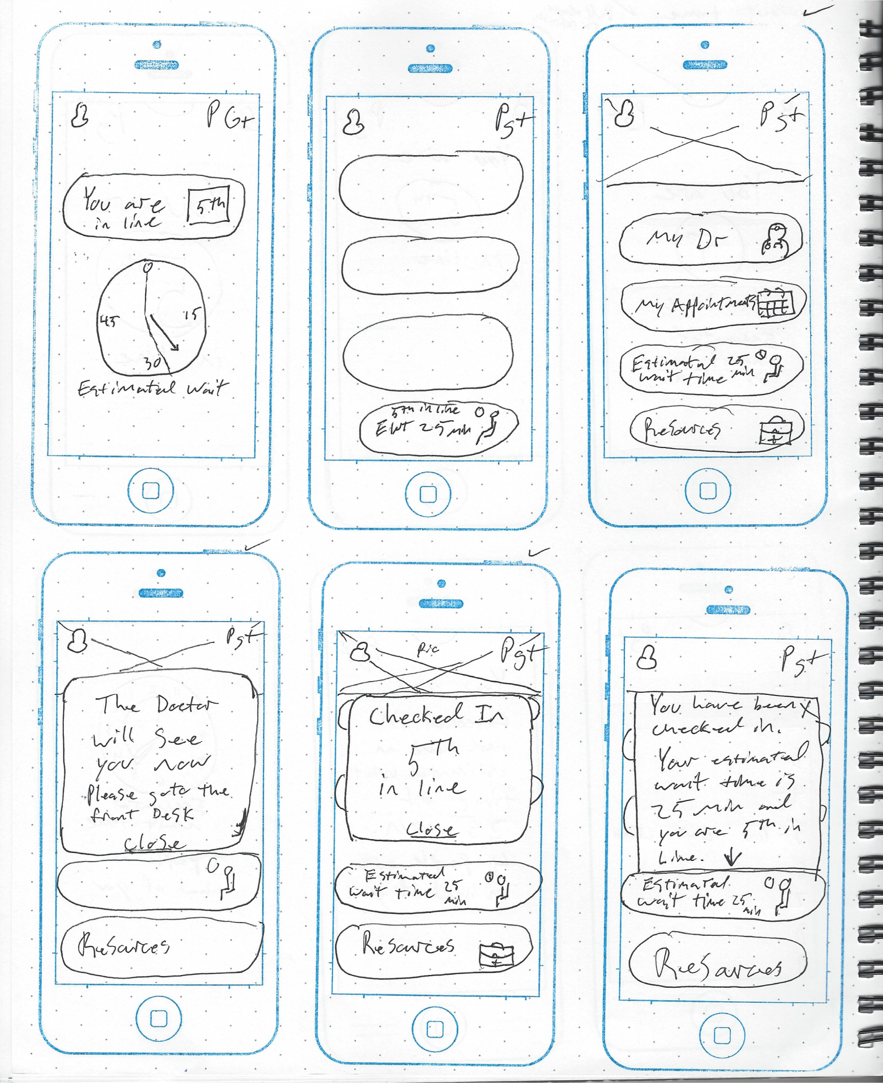
LoFi Testing
Once I had all the necessary screens to accomplish the main goals of the app I built a prototype in InVision. I found that InVision is a the fasted way to build a basic prototype and can be changed for rapid testing.
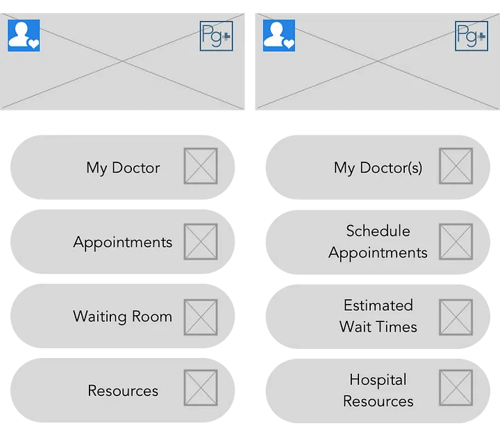
1.A/B Preference Testing
Several key screen were tested with small differences to determine preference and understanding.
2.Adapting to Change
Some screens had less than a 80% success rate of understanding and were changed based on user feedback.
3.The User Breaks the Tie
In some cases, team members insisted their idea was best despite testing. Through some deliberation, the team concluded that the user breaks the tie not he ego.
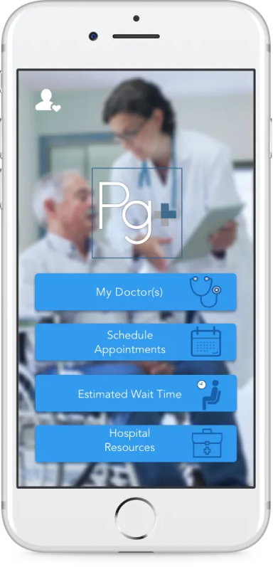
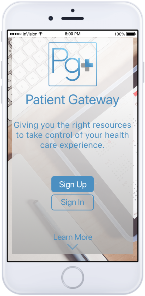
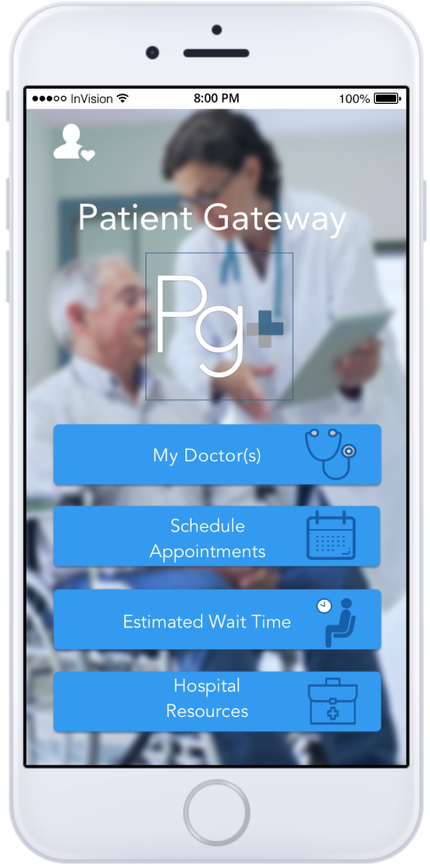
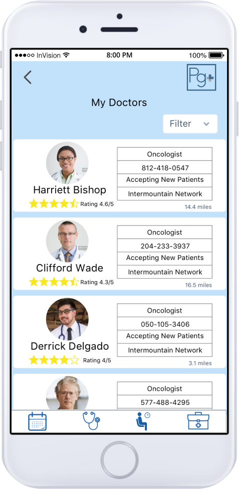
Hi-Fi Screens
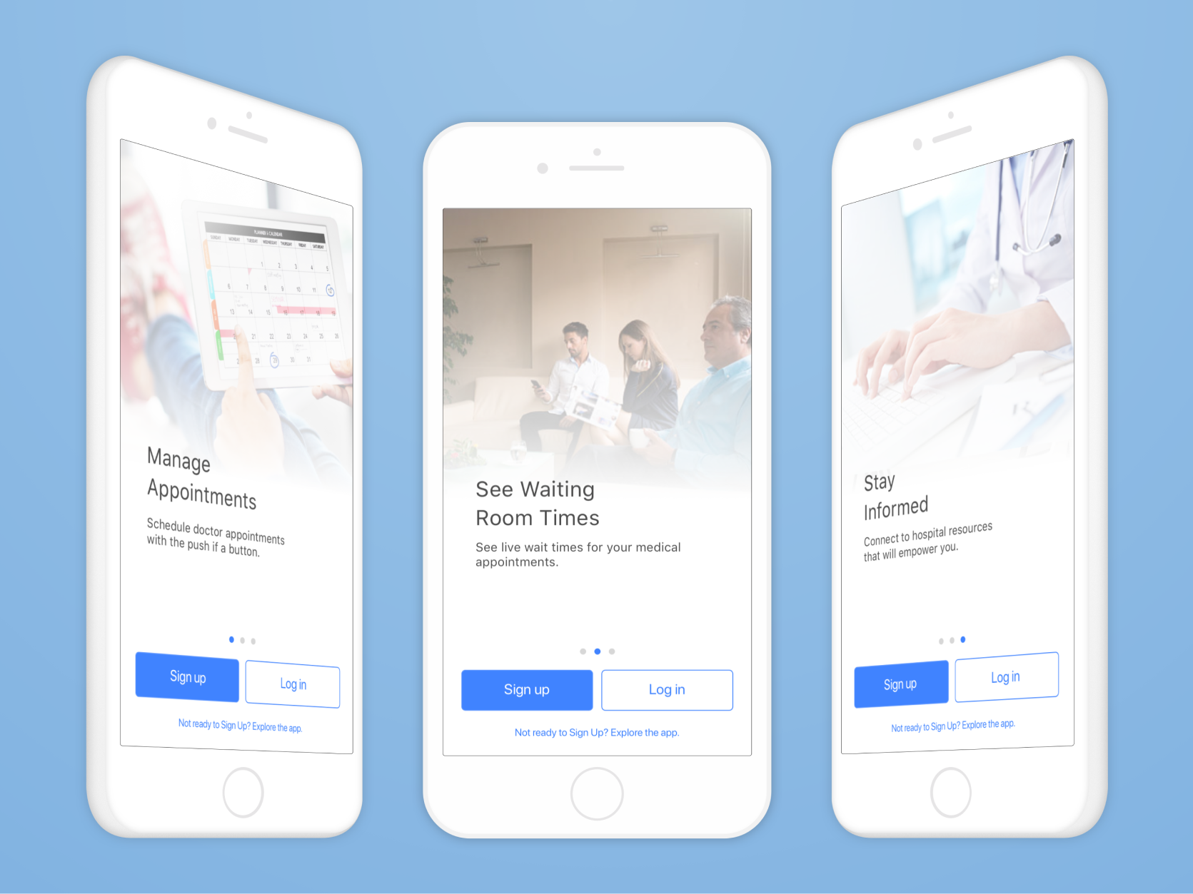
The Results
The final result of Patient Gateway is this case study and the associated prototype with the proposed deliverables.
Lessons Learned
1.Think it through:
By not planning out all the notification and form field states during the user story mapping I didn’t have sketches of them ready to build in sketch. The work was not hard, but it was time consuming and required me to ideate with sketch prior to moving on to the next step in the process. If I had thoroughly planned out every step it might have saved me some time or at least made for a more fluid workflow.
2.Don’t assume users know what you mean:
Using concise wording is what ultimately lead to a better user experience from the landing page. Seeing the various interpretations was a real eye opener to designing for other. In this case I think Antoine de Saint-Exupéry said it best, “Perfection is achieved when there is nothing left to take away”.
3.Nothing worth doing is easy:
The project got off to a great start, but some idea are harder to create without a lawyer present. Some of the feature ideas that might have large impacts like seeing patient records, got convoluted by HIPPA laws and were set aside due to the amount of research time being devoted to understanding limitations. Other ideas required integration with hospital systems and staff training. Ultimately the app is a gateway to big changes that would require ongoing integrations for the most impact.
