
What is VRBO?
VRBO ( Vacation Rentals By Owner) is part of the Home Away family and is a leading community-driven hospitality company where people can list, discover, and book unique accommodations around the world. Whether travelers want an apartment for a night, a castle for a week, or a villa for a month, VRBO.com connects people to unique travel experiences in more than 34,000 cities in 190 countries.
Project Brief
This was a design challenge to run usability testing on the VRBO mobile App, specifically the search filter. I conducted an in-person usability study in order to gather insights into user performance and challenges. The study collected information such as task completion rates, time on task, navigation and content insights, overall satisfaction, areas of concern, and unmet needs.
The Challenge
VRBO while being a well-established platform for renting out homes is not a well-known business. Most participants were not familiar with the business or the app, making the initial introduction to the platform an additional hurdle to overcome before testing could begin. Testing surfaced many usability issues that made it impossible for most applicants to reach the end goal of the assigned task.
The Solution
Findings showed that users favored a simplified user interface with form fields over the current sliders. Keeping with a simplified model, all search fields in secondary page positions were brought up front to avoid user confusion. The study surfaced quantitative and qualitative performance metrics that provided actionable insights for improvements.
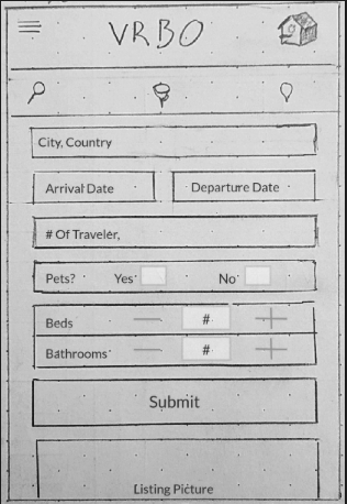
Search Filter Mockup A
This design is an attempt to give the app a creative solution to adding the desired number of rooms and bring the pet filter up front for easy access. It did not test well because it requires an exact number of rooms.
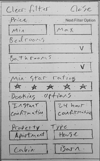
Search Filter Mockup B
This design follows a drop down method of selection for the number of rooms while giving the user an option to sort by star rating. The exactness of rooms numbers tested poorly, while the star filter gained praise.
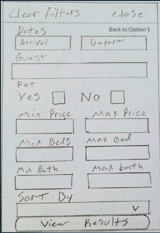
Search Filter Mockup C
The ease of use for this design received the second highest response in user satisfaction. The lack of a star rating filter to confirm past experiences was the number one reason for users criticism regarding its usability.
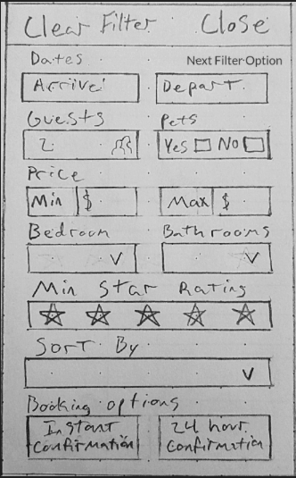
Search Filter Mockup D
User favored this design overall. Users liked that the most important information was presented upfront and early. Adding guest and pets to the same contour added more information to be presented above the fold.
Methodology
Research questions. The study collected qualitative and quantitative data to answer several research questions, including:
-
Task completion — How well does the site support the user’s ability to accomplish key goals and tasks?
-
Navigation and information architecture — How does the site structure support users ability to accomplish their tasks? Can they navigate to where they want to go and accomplish their tasks quickly and efficiently? What pathways do they take?
-
Content and terminology — Do the users understand the content and does it help them accomplish their tasks?
-
Layout and visual design — What are the user’s impression of the visual design?
-
Communication and site impressions — What are the users overall impressions of the site? Does it adequately communicate what users are able to do with the site?
Outcomes
-
Metrics. Objective and behavioral performance data that provided a usability baseline to measure future improvements.
-
Audience insights. Actionable insights on how to optimize the user experience for customers.
-
Actionable improvements. Concrete recommendations for improvements based on research findings.
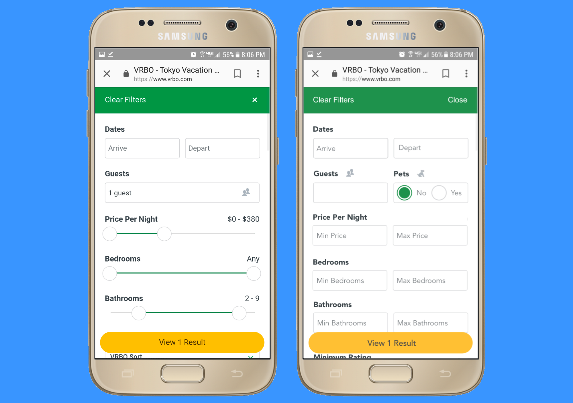
Before And After
Below is the previous search filter (left) next to the recommended changes (right). Based on usability testing, this is what the user actually wants.
