ProMap Web

Duration:

Product Overview
Responsibility
- Lead Designer
- Mange design team
- Mentor Junior Designers
Tools
- Figma
- Zeplin
- Azure Dev Ops
- Experience Builder
- Maze
- Microsoft 365

Problem Statement
Solution
Design Process
Discover, Understand, and Explore
We received feedback on which features they find valuable, what’s currently working, and current challenges users are facing while utilizing ProMap Web.
Discover
- User Research
- User Interview
- Competitve Analysis
Understand
- Object-Oriented Process Maps
- Empathy Map
- User Journey
Explore
- User Flow
- Information Architecture
Connecting the dots to new solutions:
Design
- Wireframe
- Hi-Fi Designs
- Prototype
Test
- Feedback
- Beta Test
- Survey
Target Audience

Qualitative Research
For ProMap Web, we employed a variety of qualitative research methods to ensure the tool met user needs and expectations. This included conducting in-depth interviews with agronomists and field managers to gain insights into their daily workflows and challenges, in addition to their perspectives on usability and feature requirements. Usability testing sessions were held to observe real-time interactions with early prototypes, allowing us to refine the interface based on direct user feedback. These qualitative approaches provided a comprehensive understanding of user needs, which guided the development of a more intuitive and effective tool.
Baseline Survey Results
Digging Deeper with Interviews
83%
- This is the top pain point among super users and Desktop Users.
- The majority of users expressed they either have to click around and move their mouse around until their screen fully load
- or they have to exit the application a few times for their screens/ fields to fully load. Sometimes it can take a bit of time for it to load fully.
- For some users the ProMap icon on the left side-is continually spinning.
- This includes when the user initial logs into the application and switching features.
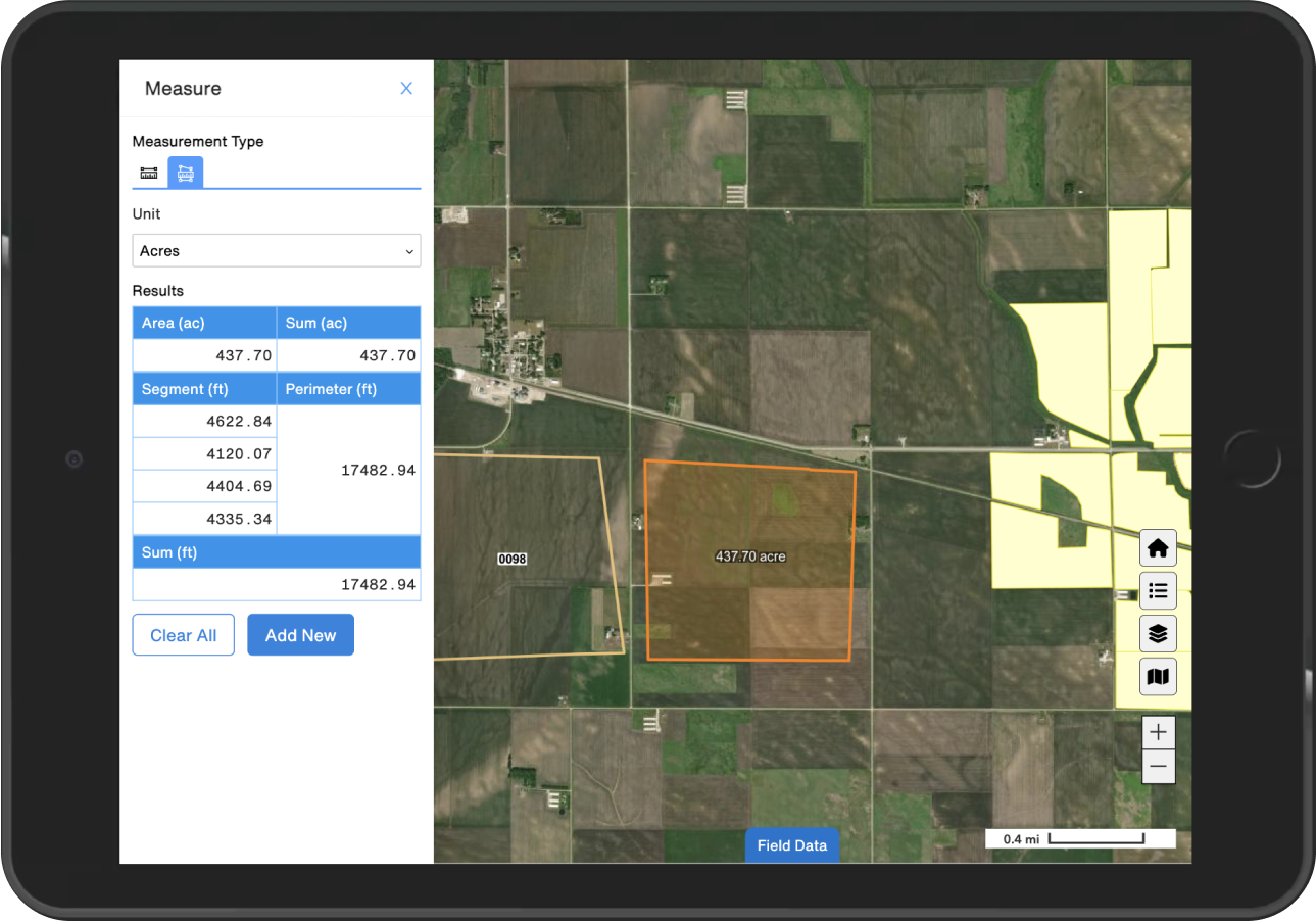
2. Measuring Accuracy
- Super users have expressed they would find value in having the capability to- measure multiple fields at the same time.
- The majority of users have expressed having the measurement capabilities in desktop- reflected in web would be very valuable and save time.
- {making this process easier for users/decreasing manual work}.
Straight From Our Users


User Personas
User Journey Map
Mapper & Admin
Adeana Smith
Scenario
Competitive Analysis
Fully Responsive
- Collapsable toolbars with iconography that matched users expected results.
- Dropdown menu of table template options to quickly narrow down results to the task at hand.
- Search with hide and seek functionality that highlights results to further narrow down results and helps users identify trends in their data.
Results
- Users responded with a 4.8 KPI, affirming the success of the redesign.
- Seamless integration into Corteva’s extensive agronomy application ecosystem highlighted ProMap Web’s adaptability and effectiveness in transforming seed field management.
- ProMap Web showcased at agronomy conferences around the world, positioning Corteva as a technology solutions leader and demonstrating their commitment to agriscience innovations.
Key Players
If you enjoyed this case study and would like to learn more about some of the talented people that made it possible, please consider connecting with them on LinkedIn.


